FCC Exceptionalism:
Website Clutter Continues
Note the title here starts with "FCC Exceptionalism". In the previous post I discussed two other aspects of FCC exceptionalism that differ from all other federal regulatory agencies:
- ex parte rules unique in the federal government
- an inspector general disinterested in agency effectiveness even though that is a statutory requirement of the position
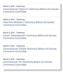
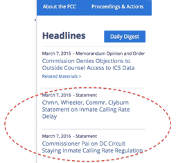
The website clutter apparently comes from trying to give the appearance of collegiality among the commissioners by giving top billing to the utterances of each and the lack of anyone having any control on the website other than filling it with announcements than can come from a variety of source.
No other regulatory commission in the federal government puts analogous statements of its commissioners, either congressional testimony or congratulatory statements or condolence statements, on the top of their website.  Indeed, not other regulatory agency even puts both the names and photos of its commissioners on the top page either.
UPDATE
No other regulatory commission in the federal government does this!
Observations on FCC FY16 Budget
This week the President released the proposed FY2016 Budget of the US and most agencies simultaneously released their proposed budget - actually their original proposal as modified by OMB in a multi month off the record process in parallel with all other agencies’ budgets. (FCC may be an “independent agency” in many respects, but in budget matters it is treated as a member of the Executive Branch.) As usual, FCC posted it in an obscure place on its website without public announcement. However, a few days later for the first time in the history of the FCC website it showed up in the rotating headlines in the upper left corner of the FCC’s homepage. Here is a link to the FCC’s FY16 Budget Proposal to Congress.
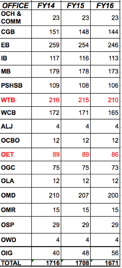
Note also that that the WTB/OET team is actually a profit center for the US Government as the recent auction results show. Yet both are drifting down in size. Some might say attrition. So while FCC faces real backlogs with dealing with new technology issues such as millimeter waves that threaten US technical leadership and also with resolving interference issues that need policy decisions that threaten the operation of incumbent licensees, the staff working on these issues will actually decrease.
What is increasing? As can be seen in the next to last line of the table, the FCC’s Inspector General’s staff is increasing from 40 to 48 to 56! The justification fro this is to fight Universal Service Fund fraud. When AT&T was a monolithic near monopolist it was agreed between them , FCC, and Congress that they would transfer money around within AT&T to subsidize rural local telephone rates with income from long distance calls. This worked well until divestiture in 1984. USF was the replacement mechanism for the old money flows internal to the old AT&T. Billions of dollars flow through the USF from our phone bills and fraud is inevitable as FCC seeks to encourage new technology with the program. So there is nothing wrong with increasing attention to such fraud and it is actually cost-effective for the tatx payer to reduce the fraud.
But, as we have pointed out previously and repeatedly, despite the good and important work OIG does on USF fraud, that is not the whole job of that office under the terms of the Inspector General Act. Until the current IG, all the previous ones were cronies of the Chairman and long term FCC staffers. They did not want to find unpleasant things that would reflect poorly on their patron. Even though the current IG is unlike his predecessor in background, he seems to follow the office tradition he inherited of not asking questions about how well FCC is run. Other agency IGs do and their statutory charter is exactly the same. So if the FCC IG gets 56 FTE in FY16 will he break with the past and use some of this for the matters he and his predecessors have been carefully avoiding in the past?
So When are the Comments on this NPRM Due?
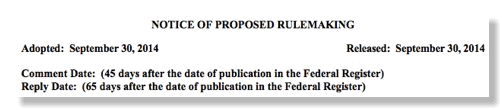
An interesting question heard both inside and outside FCC is “when are comments due to NPRM x?” When NPRMs and similar documents that result in comments are released they usually are written as shown above with a date relative to Federal Register (FR) publication. (The Net Neutrality NPRM was a notable exception and had a clear due date on the version released by FCC.) The reason for this relative date is due to uncertainty in FR publication date which can be large compared to the comment period in many proceedings. Your blogger believes that much of variable delays in FR publication is due to back office problems at FCC in work groups of career civil servants that have low visibility and low pay grades but perform key ministerial functions in the final release of FCC documents, oddly called the “BARF process”, and in the final formatting of the text for transmission to the folks at the FR. (When documents contain tables and other unusual formatting there are usually problems getting them in the specific forma acceptable to the FR. Incorporating nonfederal standard by reference, e.g. as in §15.31(a)(3), also adds uncertainty to the final approval process due to its complexity although it is generally desirable.)
So how do you find out when things are actually due? Large law firms have paralegals that scan the FR every day for FCC items and update internal data basis for their lawyers who then inform their clients. Important items make the news in expensive trade publications such as TR Daily. But what about the rest of us?
The bureaucratic answer is to search for the published items in either the FR site or the newer Regulations.gov, “Your Voice in Federal Decision-Making”.
(Regulations,gov is part the eRulemaking Program, established in October 200as a cross-agency E-Gov initiative under Section 206 of the 2002 E-Government Act (H.R. 2458/S. 803) and is based within the U.S. Environmental Protection Agency. The eRulemaking Management Office (PMO) leads the eRulemaking Program and is responsible for the development and implementation of the public facing website, Regulations.gov. FCC is not a “partner agency” in the eRulemaking Program because it required shared funding. FCC is classified as a “Nonparticipating Agencies” in the program and its is not fully integrated - again a nod to FCC’s perpetual budget problems. The Office of the Federal Register (OFR) of the National Archives and Records Administration (NARA), and the U.S. Government Printing Office (GPO) jointly administer the FederalRegister.gov website.)
While working at FCC, your blogger tried and experiment to address this issue. The attempt is shown below and actually still lingers with old data on the FCC’s vast disorganized website:
Circa 2006 Experiment in Making Docket Information More User Friendly (Click to expand size)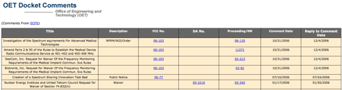
This table with its links to both EDOCS and ECFS as well as comment date data is one simple, user friendly way to present data. Note the “title” of each proceeding is not the official title on the caption of the coverage of the FCC document. The official caption is often a cumbersome name or one assigned early in the drafting process before the scope of the proceeding was firmly established. The tile is a plain English description of what the docket is actually about, like “net neutrality”.
So why can’t FCC give us a simple way to find to when comments are actually due in its proceedings?
New FCC Website Problems: Did They Foretell the Obamacare Website Fiasco?

On June 30, 2009, Chairman Genachowski told the FCC staff
We will use technology and new media to enhance the everyday worklives of FCC staff, green the agency, and improve overall operations of the FCC – running efficiently, communicating effectively, and opening the agency to participation from everyone affected by the FCC’s actions. And, stay tuned, we will have a new FCC website.
On April 5, 2011 the new site was unveiled. It was developed by MetroStar Systems, a Small Business Administration (SBA) 8(a) company that describes itself as “a leader in full-service information technology (IT) and strategies for new media and enterprise collaboration” and is powered by Drupal, an open source content management system. It also uses cloud technology.
Your blogger has generally defended the new website, however, it clearly has major problems. Despite its modern technology behind the screen and better visual design, it frankly doesn’t make much information any easier to find than the old primitive design. Indeed, it is widely reported that most users still go to the old design which is still operational!
So what does this have to do with Obamacare? Was MetroStar Systems really the best contractor for the job or did the same federal procurement rules the gave the Obamacare contract to CGI Federal limit what firms could effectively bid on the job? Federal contracting laws passed by Congress are nightmarish and for dealing with cutting edge fast moving topics like website design hard to use. Thus the usual contractors are those who have the patience to deal with the complexity of federal contracting, NOT those who can do the best job.
Maybe the problems of the FCC design should have been a tip that such projects under present federal contracting legislation and rules are very difficult to implement.
Doraemon Gets Promotion from Japanese Government:
But FCC Problem Remains


A Major Japanese news service reported:
(Kyodo) _ The Japanese agency for the popular cartoon series featuring the robotic cat Doraemon said Tuesday it has sent a complaint to a U.S. government agency over its use of a "quite similar" character on its website.
Fujiko Pro, the holder of Doraemon's copyright, has determined that the U.S. Federal Communications Commission is using a character named "Broadband" which is almost identical to Doraemon on its website section for children, said the Japanese agency Shogakukan Production Co.
Shogakukan Production, entrusted by Fujiko Pro with copyright protection, said it has sent a written complaint along with documents including excerpts from the cartoon to the FCC, requesting the commission seek permission whenever it uses the character for the purpose of profits.
But the FCC has made no response and has not deleted the character from the website so far, the Japanese agency said.
Broadband appears on the website's "Kids Zone" as a guide introducing children to the roles of the FCC, which oversees interstate and international communications. The agency also handles copyright issues.
One major difference between the two characters is that Broadband has ears while Doraemon does not.
The cartoon and animation series featuring Doraemon is especially popular in East Asia. The show was first aired in Japan in 1979, but has not been aired or published in the United States.
The controversy is discussed on FCC’s Japanese languageWikipedia page although not on its English version.
But now that Doraemon has been promoted to ambassador by the Japanese government, this issue may escalate.
FCC Dismisses Complaint Related to OETB65C RF Safety Issue
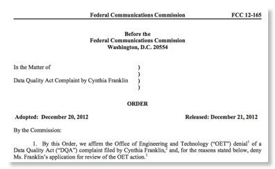
On December 20, 2012 FCC, in the above action, dismissed a complaint by Ms. Cynthia Franklin under the obscure provisions of the Data Quality Act (“DQA”) - a 2001 piece of legislation your blogger had never heard of before.
Before getting into the details of Ms. Franklin’s complaint, let me point out that document is a reminder of a more general problem of the FCC website even after there recent improvements: Despite the huge amounts of (poorly organized) data on the FCC website, this complaint and the supporting document are nowhere to be found because it is a “undocketed” proceeding that also lacks any file number. Thus its very existence was unknown to the public until the 12/21 date of the above Order. Indeed even now there is no obvious way to see the whole text of the complaint short of filing a FOIA request and having FCC staff then quibble over whether they should charge you to see this information. Is this really “a government worthy of its people”?
(I also note that as of the drafting of this post, a search of the FCC website on “Cynthia Franklin” yields no results at all!)
OETB65C
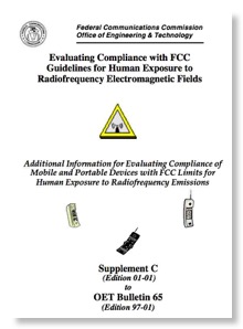
Back to the specific issue of Ms. Franklin’s complaint, this deals with an issue that has been discussed here repeatedly since November 2010: OET Bulletin 65, Supplement C (“OETB65C”). This document has as a title, “Evaluating Compliance with FCC Guidelines for Human Exposure to Radiofrequency Electromagnetic Fields Additional Information for Evaluating Compliance of Mobile and Portable Devices with FCC Limits for Human Exposure to Radiofrequency Emissions”. This document describes its function as:
The purpose of this revised supplement is to provide parties filing applications for equipment authorization with guidance on complying with the latest requirements using up-to-date test procedures. This supplement is not intended, however, to establish mandatory procedures, and other methods and procedures may be acceptable if based on sound engineering practice.
Thus it is not a “regulation” because it is not “mandatory”, but it does give a “safe harbor” showing equipment authorization applications what FCC will accept for compliance showing with RF safety issues. As Time Magazine pointed out in 2010,
FCC testing regulations notably chose not to simulate a situation in which the phone was broadcasting at full power while inside a shirt or pants pocket flush against the body, an odd oversight given the known habits of many cellular-phone users.
OETB65C was issued in June 2001 and lists 2 authors and 3 contributors. (Only one of these people still work at FCC and I suspect he had little involvement with the controversy at hand.) Your blogger worked in OET management at the time and had absolutely no involvement. Indeed, OET was under acting leadership in the early Powell chairmanship at that time as Ed Thomas did not arrive as its chief until early 2002. As quoted in the FCC Order (remember, the actual compliant is still not on the public record due to the website problems mentioned above), the Franklin complaint deals “three of the FCC consumer documents” arguing that “the documents should be corrected to state that cell phones are not tested for RF exposure during use in direct contact with the body, and therefore they should not be used in such a manner.”
The December 20 Order reaffirms OET’s October 2011 rejection of the Ms. Franklin’s compliant - a document also not on the public record. The grounds seem to be a narrow interpretation of the Data Quality Act. Perhaps thee grounds are even a correct interpretation of the Data Quality Act.
Here is a sample of the FCC’s logic:
Ms. Franklin’s concerns, however, misconstrue the purpose of the document at issue, which is not to provide advice on how best to hold and use a cell phone, or to allow consumers to critique the sufficiency of testing methods, but rather to explain why a single reported maximum SAR value is an insufficient basis for comparing the likely RF exposure from individual cell phone models. Indeed, the guide emphasizes that SAR testing “does not indicate the amount of RF exposure consumers experience during normal use of the device.” And while Ms. Franklin asserts that the guide will encourage consumers to carry cell phones against their bodies, the only statement in the guide about how to carry a phone is quite to the contrary, noting that “the most effective means to reduce [RF] exposure are to hold the cell phone away from the head or body and to use a speakerphone or hands-free accessory.”
So basically the document at issue is not guidance to consumers, so it doesn’t matter if it is misleading! It is just guidance to cell phone manufacturers on how to avoid the intention of the FCC’s RF safety rules and there is no Data Quality Act issue involved in that under FCC’s logic.
Cell phone industry: If you want to gain the trust of the US public on RF safety issue you should not hide behind such charades. While your blogger believes that cell phones as actually used these days are safe, the sordid history of OETB65C does not reflect well on the cell phone industry and FCC’s objectivity on safety issues. Better transparency is needed in the drafting and implementation of FCC Rules on RF safety to keep the public trust.
Survey: Major Wireless Developments 9/10 - 9/11 by Ari Fitzgerald & Mark Schneider
Ari Fitzgerald
Mark Schneider


The paper was presented originally at the Practising Law Institute’s 29th Annual Telecommunications Policy & Regulation Institute publication in December 2011. Long time readers may recall that we have written about this event before in this blog. PLI is a nonprofit group that charges high (>$1000) prices for both attendance at its events and copies of the material presented. There is nothing wrong with this so far.
However, PLI events get ALL the “movers and shakers” from high FCC leadership, e.g. commissioners and bureau/office chiefs, who give presentations to the honchos of industry and K Street firms without making the same information available to the public. I have previously suggested to FCC that if these presentations are prepared with federal resources they should be made available to the public and if PLI is selling videos of the presentations, the FCC should demand copies of the presentations by FCC officials as a precondition for their presentations. Such videos should then be posted for the public within a few days of the PLI event.
On the FCC website I can only find the text of Comm. McDowell’s presentation for the 2011PLI telecom event and nothing for the other FCC presenters. There are, however, copies of Chmn. Kennard’s presentation in 1997 and 1999, Comm. Tate’s presentation in 2008, Chmn. Hundt in 1997, Comm. Copps in 2006, Former WTB Chief Muleta in 2003, etc. Thus there is precedent for making the presentations public, but no consistency.
Also, NTIA Chief Strickling made public his remarks at the 2011 PLI telecom event.
So if you want to hear public officials speak on telecom policy, you can sign up now for the 2012 PLI telecom event on December 6-7 for a mere $1,595.00 OR, FCC could adopt the policy advocated above that the presentations by public officials about the public business should be made public within a few days.
Meanwhile, kudos to Comm. McDowell and NTIA’s Strickling for making their presentations public along with Ari Fitzgerald and Mark Schneider for making their thorough review available to those of us who do not work for or have not hired a K Street law firm, e.g. the “99%”.
In Defense of the New FCC Website
Readers of this blog know that the problems of the FCC website have been a recurring theme. I have been quite critical of the “yellow design”. Yet until now I have not commented on the new “blue design”, except for the relatively minor FCC seal issue - since resolved.
The website has a public feedback section and many posters have been quite critical. Here are some quotes:
The new site looks very pretty, but unfortunately it appears to have been designed by graphic designers and not by anyone who actually uses the FCC's site.
Those of us who live at this site prefer the old way with everything right there. This new site is too "consumerish" and is great for Mabel Brown from Squattingpigeon, MO who is visiting the website to complain about getting calls at 2 in the morning despite her insistence that she's on the "do not call" list.. This new site (IMHO) disenfranchises the professional user.
The only way to improve this site is to bring back the old one. This new web site is just awful. It's too hard to find anything, even a simple search for a broadcast station. What a waste of taxpayer money.
Looks like a used-car sales-pitch; go back to what you had and add functionality. This looks like a site for spinning what the FCC wants to sell the public rather than a legitimate government portal to involve the public in governmental decision-making.
Very difficult to navigate as you not only moved the "stuff", but you renamed it! I spend over an hour trying to use the license "search" feature, and finally went back to the old site and found what I need in a few minutes.
The purpose of a government website such as this is not to cater top those of us who live and work “inside the Beltway” and are card carrying FCBA members. The purpose is to serve the public which includes both FCBA members and “Mabel Brown from Squattingpigeon, MO”.
Does one need to know the difference between ECFS and EDOCS in order to find public information at FCC? Does one need to know that the “Universal Licensing System” is only “universal” for the universe of WTB? Pity on anyone outside the Beltway who wants to know about or contribute to the GPS/LightSquared controversy which is hidden away on “MyIBFS” under “File Number = SATMOD2010111800239”.
The status quo ante may have been good for FCBA members who “paid their dues” but did not serve the public interest. That said, I have trouble seeing the need for multiple videos on the home page.
But the Commission has announced MyFCC which will allow people like fellow FCBA members to get directly to the information they seek. They also have be good at seeking feedback and making it public. Finally, the old “yellow design” is both still operational and prominently linked to the new design during the phase in. I think the long term scenario is that insiders will use MyFCC most of the time and those “outside the beltway” will get a site they can use too. We are not there year and feedback to the feedback page is the best way to make your voice heard.
FCC Test Drives New Website Design
It is unclear whether the new website addresses a major problem of the old website: nobody was really in charge and lots of people could clutter the “prime real estate” of the home page with their pet projects and announcements. Presently, it has a new type of clutter - 6 videos of bureau chiefs talking on their favorite topics. One wonders if all 5 commissioners will demand equal time?
Another observation is that the new design still takes more than 2 screens to display the whole vertical height. Now Whitehouse.gov also needs 2 screens, but a lot of agencies like the previously discussed FERC are able to organize their whole complex mission into 1 screen full.
The FCC explained the philosophy of the new design in a press release. The Commission also welcomes comments on the new design.
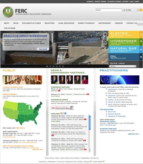
Why Can't FCC Have as Good a Website as the Obscure FERC?
I have written here several times about the endless clutter on the FCC website. The current website design dates to the Hundt chairmanship and may have been cutting edge at the time, but would be an embarrassment to most teenagers in this age of Facebook.

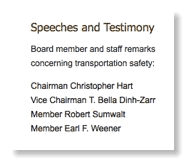
Recently the Federal Energy Regulatory Commission (FERC) revised its website. FERC is the successor of the former Federal Power Commission and was created within the Department of Energy as an independent body. Like FCC it has technical jurisdiction as well as nontechnical and merger jurisdiction over several industries: gas, oil, electricity, hydropower, pipelines, etc. Like FCC it has a complex workflow.
The new FERC design manages to fit this workflow into a neat homepage that efficiently send users where they need to go. It even has room for photos (but not the names) of the 5 FERC commissioners even though no other commission in the federal government other than FCC even names its commissioners on its homepage.
Somebody has to be in charge and have the authority to tell bureau chiefs and commissioners that they can not clutter up the homepage with news of their favorite pet project. A clean, well organized homepage helps everyone quickly find the information they are looking for. It is not enough to have lots of information like the FCC website has, one has to be able to find wanted information quickly.
Other commissions and agencies have this discipline, why can’t FCC?
FCC Website Clutter
In October 2007, this blog described the clutter on the FCC website and compared it to other agencies.
Among the points made at the time nearly 3 years ago were the following:
1) Search engine.
2) Clutter, clutter everywhere. Apparently there is no self control at all on putting more information or more links on the FCC home page.
- Too many links for the same document.
- No other federal commission clutters its home page with individual commissioners's links.
3) Is anyone in charge here?
4) Difficulty of finding information without prior details.
5) Lack of links to specific FCC rules or statutes.
So what has happened since? Well, the search engine has improve a lot. It would be nice to order the results by date, but at least you get results now. At one point searches on “Kevin Martin” got only a handful of links, now searches work reasonably well.
The plot at the top of this page is from the original post and compares the clutter of various agencies’ websites. At the time, FCC had 260 links on its home page, more than any other agencies surveyed, and a total of 1188 words, putting it slightly behind Interior at 1233. But FCC was clearly the clutter leader in the NE corner of the plot!
So where does FCC stand today? While your blogger doesn’t have the patience to analyze the other agencies all over again - it is clear that no other agency has the FCC’s obsolescent cluttered design - today’s results for FCC are 259 links and 1105 words. So a net decrease of 1 link and 83 words. Positive movement in the right direction, but a long way to go!
FCC also remains the only commission is the federal government that clutters its homepage with individual links for each commissioner, not to mention a separate link for “All Commissioners & Press Photos”.


 (Does not include readers using RSS feeds.)

![[Valid RSS]](valid-rss-rogers.png "Validate my RSS feed")

